User Experience in the LMS: A Priority Often Forgotten


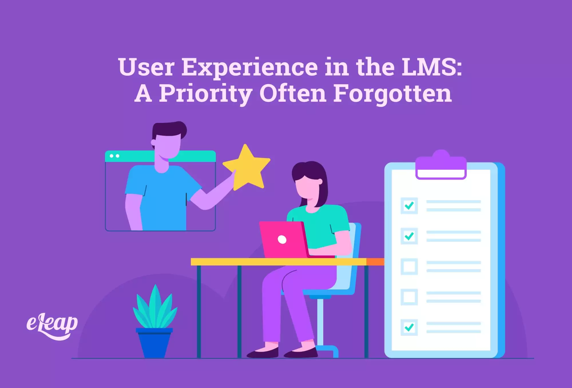
The user experience is perhaps the most integral part of the entire implementation of a learning management system. After all, if your employees can’t easily navigate the platform and upskill their abilities without hassle, you’re not going to get the results that you want. Not only that, but you’ll be lucky to get an engagement at all. Organizations don’t have time to follow people around making sure they’ve completed the necessary training and learning modules. And yet, so many still do, often creating deadlines and imposing penalties rather than sitting down and talking to the team about why they’re putting it off and how it can be more inviting.
The problem, often, is that when it comes to choosing an LMS, people are focused on things like integrations, features and included tools, and so forth. These are all important elements, but without a solid user experience, they will never deliver. The caveat is that to deliver the best user experience (UX), you’ve got to know what that means.
What is the User Experience?
Essentially, user experience is a term that refers to how the user (in this case employee) interacts with a system, product, or service. Essentially, it’s all about how people interact and engage with your LMS, in this case, and it’s crucial that you take the time to put some thought into this part of your strategy.
With a learning management system, it’s going to be important to have a well-designed dashboard and user interface, as well as accessibility features, ease of navigation, scalability, flexibility, and so forth. Essentially, it’s all about how someone navigates and interacts with the LMS, and organizations need to make sure that experience is a good one every single time.
What it Means to Have a Positive User Experience with an LMS
When an organization’s LMS offers a positive UX, that means employees will engage more frequently and improve their training skills better than if the user experience was jagged, difficult, or just not well-thought-out. A good user experience isn’t just about having all the best features. It’s about whether those features are also intuitive enough to make them easy to use, even for beginners.
Companies that want to maximize their user experience in the LMS will need to do some research on how their team best interacts with technology platforms and what they expect from a learning management platform. Ultimately, it’s about creating a platform that even the least tech-friendly person could use for training and upskilling.
Features of a user-friendly LMS
Although there are several different features to explore on an LMS, there are four main areas to consider when it comes to UX design and quality. These four factors are:
- Accessibility
- Ease of use
- Consistency in layouts
- Intuitive design
Each of these plays its own role in creating the ideal UX for an LMS, or any software for that matter. Organizations will have to look at how these factors impact their chosen design, as well as which factors are most important to their users—some employees may be less focused on the design so long as the LMS is easy to use, for example, so an organization would focus more on ease of use in that instance.
Accessibility
Too often, this term gets interchanged with ease of use. However, accessibility is less about ease and more about creating a platform that can be accessible to all users, regardless of any specially-abled needs. This includes things like color adjustments for those with visual issues, reading assistance for the visually impaired learners, and even ADHD-friendly features to keep engagement at a maximum. These are features that add to the experience while also creating an inclusive learning environment.
Ease of Use
This isn’t just about having a good interface or a pleasing design. Ease of use refers to how easy it is for the end-user to understand the LMS functions, its content, customer support, integrations with other applications, and so forth. It can feel like it gets a little complex, but if you choose a straightforward LMS that features simple navigation, you can avoid creating a system that users can’t even figure out, let alone use without obstacles or confusion.
Layout Consistency
Consistency doesn’t just mean using the same layouts or similar colors. Yes, those are important, but only as a part of the larger whole of the LMS platform. Essentially, if you’re using a white-label LMS, you’ll want to brand it accordingly so that there’s consistency and continuity throughout the entire platform. You’ll also want to make sure that navigational features remain the same and give people something to rely on. That predictability will lead to further ease of use and that will increase the engagement of learners.
Intuitive Design
Sometimes this element also gets confused for ease of use. It would seem to some that they are similar, but they’re actually two different elements. In an LMS, intuitive design means that learners can quickly gain access to the platform and understand how to use it with minimal effort. The learning curve needs to be small because neither the organization nor the learners have time to dedicate to learning how to use the platform in the first place. Intuitive design means easy engagement and inclusive learning.
The Bottom Line
Organizations can have the best of intentions, and even some premium content in their LMS. However, if the platform is clunky, difficult to navigate, or otherwise not-so user-friendly, it’s going to be difficult to get anyone to engage. The online training and education of an organization depend entirely on how functional and user-friendly the platform is. Some organizations are realizing that their LMS doesn’t quite stand up to the demands of their employees or the unique UX needs of their learners. If that’s the case, it may be time to switch to an LMS that allows you to customize and personalize the learning process to create the perfect user experience for every single employee.